Board Process
Purpose
The promotional bulletin boards purpose is to grasp the viewers attention. The board is meant to Promote our CTE Programs and show people how our programs support our SkillsUSA chapter. It is also meant to show people that no matter what path you choose to walk, our SkillsUSA chapter has a place for you.
Design Process
 The planning for the board started with setting an overall theme. It needed something that related to no
limits, it had to be something unique, and it had to be an eye catcher. We started with 4 concept sketches.
The ideas started with making a brick wall that had removable bricks. It would simulate that the wall would
not stop us (no limits). However after some consideration we moved on from that idea, we felt it wouldn't have
portrayed the message we were trying to convey. Then there was the idea of some sort of mountain, or a person
climbing on a ladder. Again this idea fits with the no limits theme; someone breaking the limits. This idea
felt unoriginal so we decided to keep sketching. At this point we felt a bit of an art block. We went around
to teachers and students asking them what they thought of when we said 'no limits'. That's when a teacher of
ours said he thought of flying squirrels. Now as creative as this sounds we did not end up designing a flying
squirrel but it did give us our next idea which was someone skydiving. It was fitting with no limits because
skydiving is crazy and breaking limits. Again though, this didn't feel unique enough for us to follow through
with it. We kept thinking about things you can do in the sky, and no limits. Then we got the big picture and
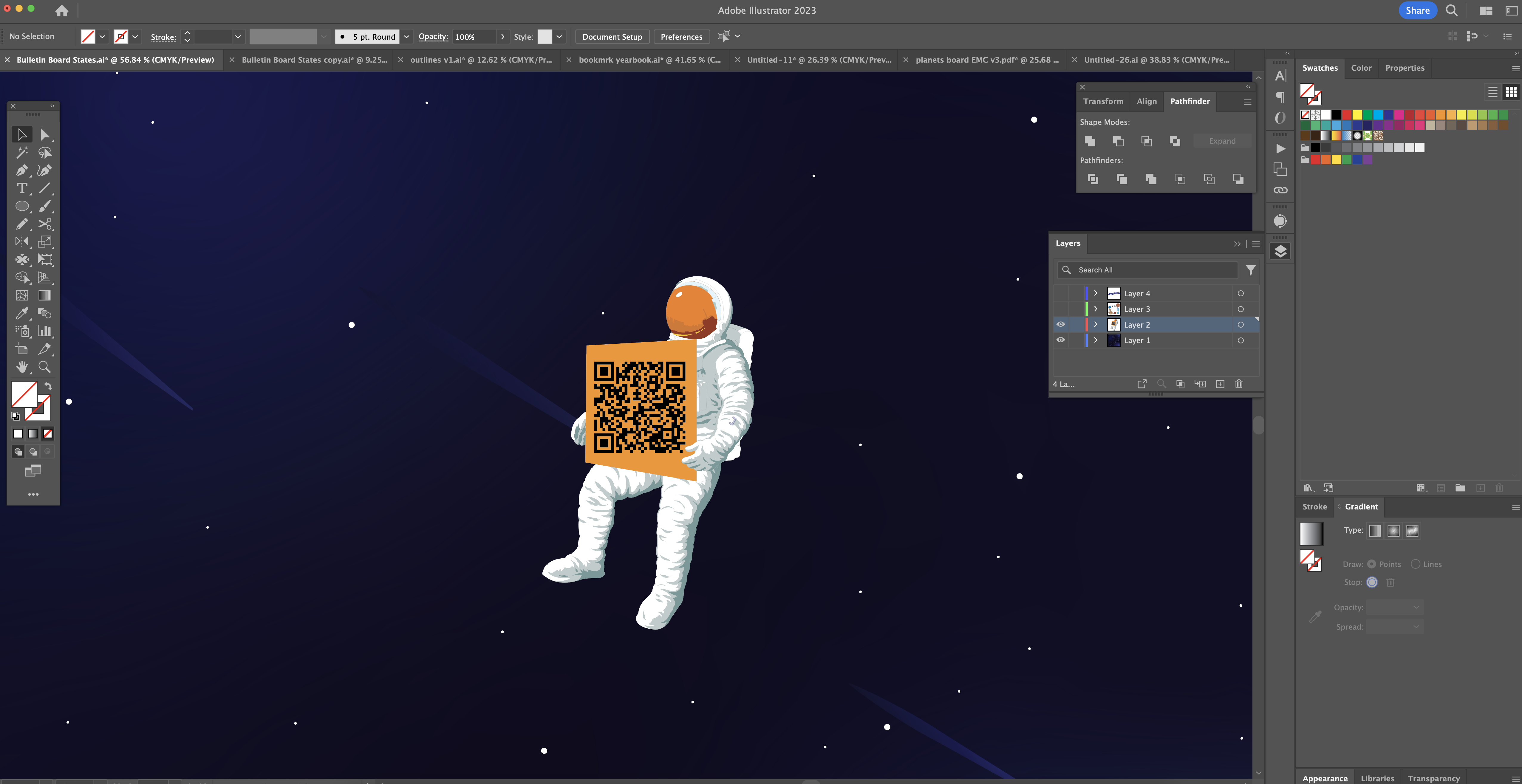
we thought, space, there are no limits to space. So we started with an astronaut.
As we keep looking at this astronaut we think, how cool would it be if it could move around the board,
simulating that it doesn't have any limits and can move freely around. At this point we were really happy with
this idea. It was unique, it fit no limits really well, and we felt confident we could make something really
appealing to look at.
Our next step was taking it to Illustrator, as we did so the idea really started to develop and take place.
The galaxy background was made first. We looked up different galaxies for inspiration and tried recreating the
look of them the best we could. We used different gradients and blurs to get this effect and we loved the way
it ended up looking.
Getting the background situated really helped the design process take place. The galaxy had a cartoon feel to
it. We then made our solar systems 9 planets (including pluto) in Illustrator. We did this because we have 9
CTE programs and it felt almost perfect doing the 9 planets. This didn't stick however, it was decided that
having it be random planets would make it seem more like no limits. Having it be planets that were outside our
solar system. This also allowed us to play around with ideas a little more. We didn't want there to be
confusion with the layout of the planets, or have inaccurate sizing. It just made more sense having it be our
own planets.
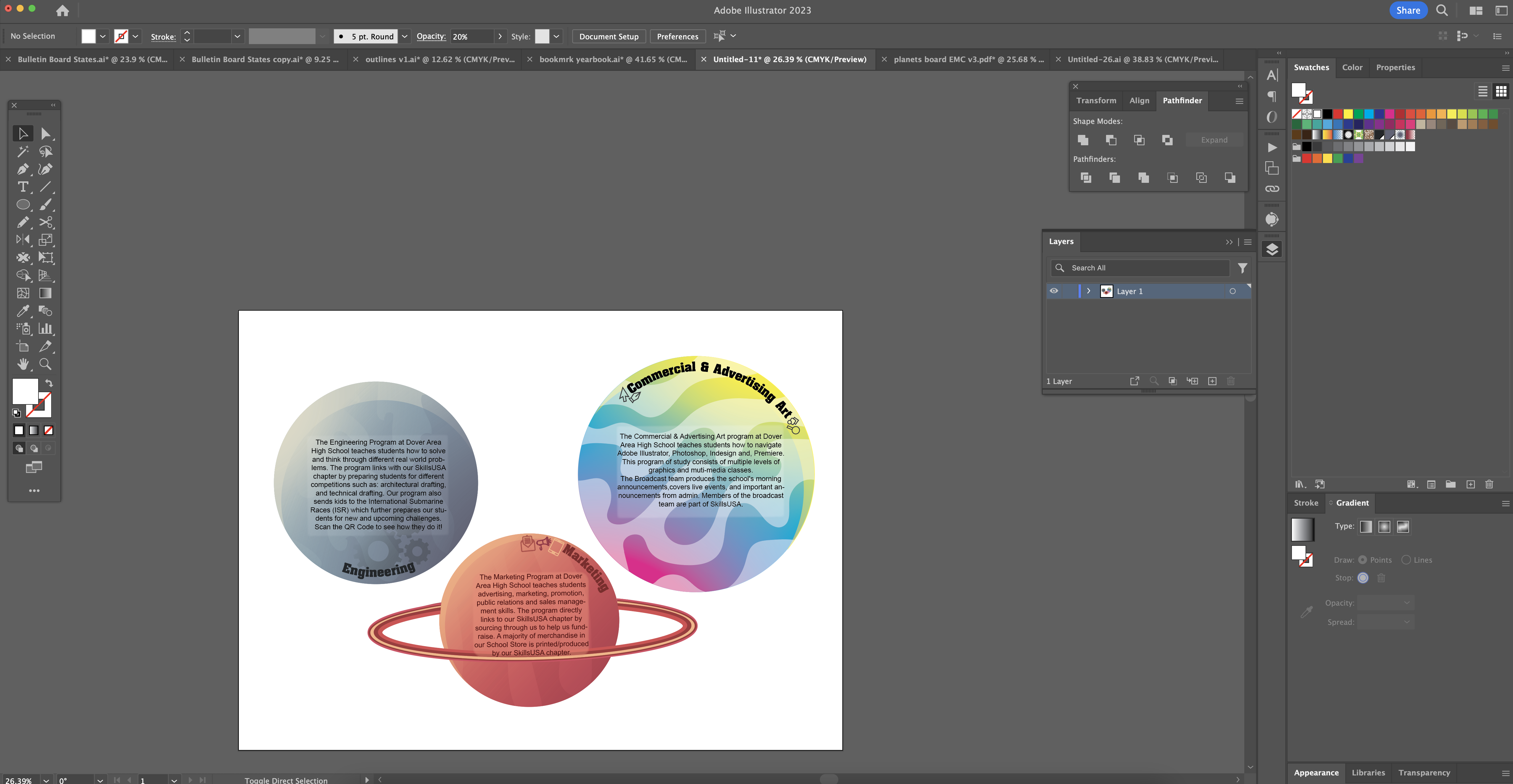
 We have three major planets for the three major CTE programs that correspond with our SkillsUSA chapter.
Marketing, Engineering, and Commercial and Advertising Arts. These three had their own special design
implemented into the planets.
We choose the colors for the marketing planet so the planet would stand out against the dark background. The
reddish pink colors also represent our school store (The Red Zone). We added rings to allow it to stand out
from the other planets. We then added icons and a title to the planet so it was quickly identifiable.
The colors for the engineering planet are to represent factories and industrial cities. The darker blues and
grays would allow the planet to stick out amongst the other planets displayed on the board. The gears on the
planet and title are for quick identification on the planet.
When making the advertising art planet it was obvious that the colors would be CMYK (the primary colors of a
printer). We also made the stripes in it a little more goofy and abstract to show more creativity within the
planets. We decided the icons needed to be on each side of the title due to the name being so long on the
planet.

Lastly we designed the interchangeable planets. These planets are interchangeable due to the fact that our
vocational school is newer. We have programs that come, go, and change as our school grows. We also will
update the interchangeable photos that go along with those planets. We find this is necessary for us so we can
showcase each program as they are in our SkillsUSA chapter. We have different sizes of these planets for
multiple different reasons. We don't have students from every single pathway in our SkillsUSA chapter, so the
size of the planet is related to how many participants we have in that pathway.
Materials
For the materials, the base of our board is a Red Brick hardboard with 20 GA sheet metal cement glued together. We chose these because we knew we wanted our board to be magnetic but the sheet metal needed a backing because it would have been unstable by itself. For the planets and the layers, we used Palight Foamed PVC sheets wrapped in vinyl. We used the PVC sheets because it is rigid and easy to put vinyl on. To connect the planets to the base of the board, we used magnets to make sure we could slide the planets and they would stay in place. In between the layers and base of the board, we have spacers to ensure that everything stays in place. We used epoxy to connect all stationary parts.
Construction
When we first started to come up with the idea we had to lay out everything on a proof print. We needed to see
how we would even make it happen. We printed a background then cut out the shapes for the layers. We then
tried several different sizes of planets to get the right size. To understand what we really wanted with the
engineering process, we had to conduct a lot of trial and error. After a lot of deciding, we finally decided
to go with what our board now looks like.
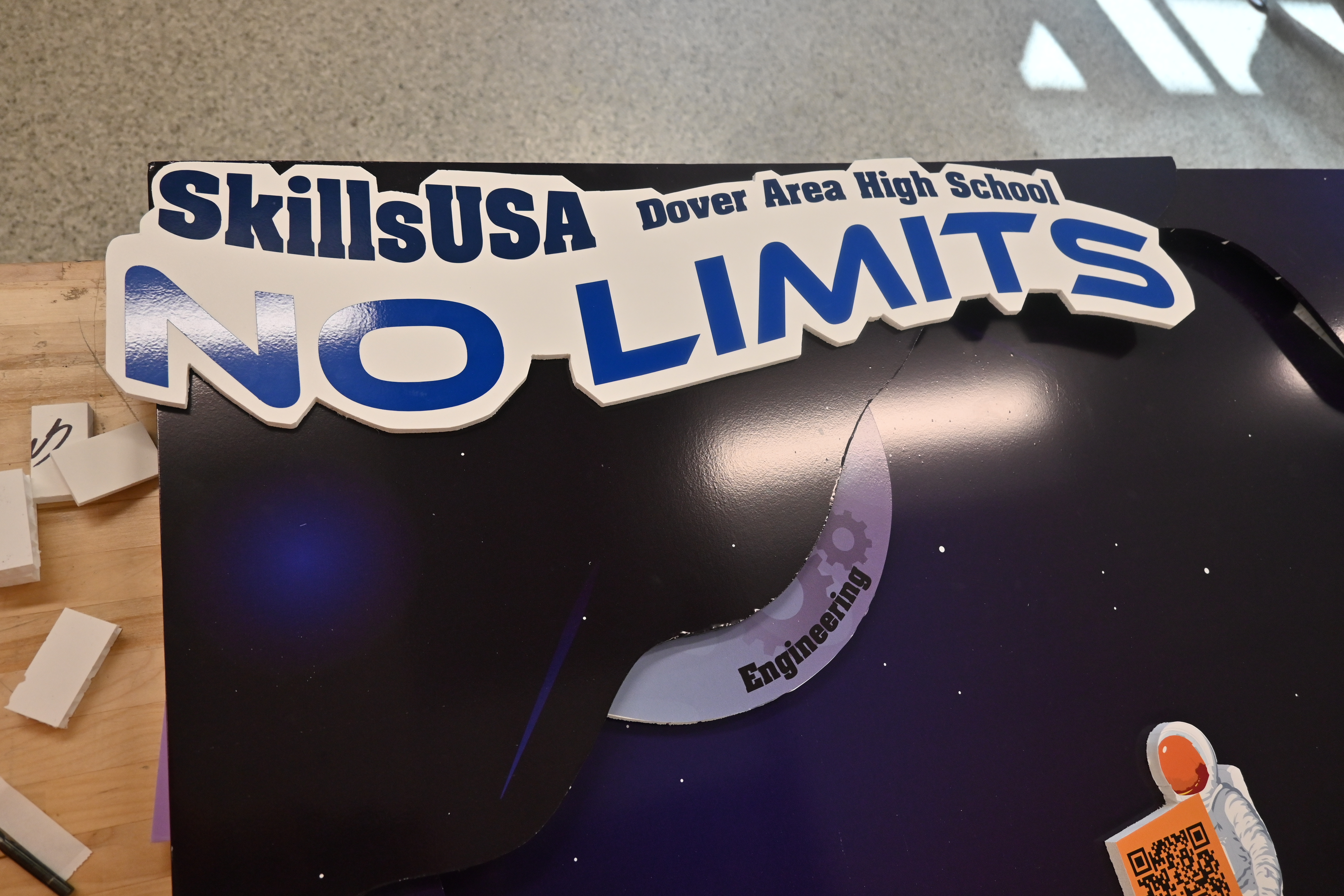
For the construction of this board, we started with bonding the bases together with contact cement. The base
is made up of a piece of sheet metal and brick wall paneling. While the contact cement was setting we printed
the background and then applied it to the board. After that we cut the shapes of the layers from a 4' X 4”
sheet of PVC foam board. We then wrapped them in printed vinyl to match the galaxy background. We followed the
same process for the planets by printing them on vinyl, adhering the vinyl to the PVC foam board and cutting
them to the shape of our planets. as well as our space man. Before final assembly of the board we tested
fitted the pieces. Since our ultimate goal is to have the parts actually move in and out with the spaceman, we
had to reshape some elements so the appropriate amount of the planets would be hidden or revealed when the
space man is moved. We think this will make the display more interactive and appealing to our audience.
We first made the board to make the spaceman move the planets when we would pull him in a direction. In
reviewing the contest requirements, we realized that we are not allowed to touch the board during the
presentation. To meet this requirement, we simply removed the rubber bands and so the planets would remain
stationery. We wanted the board to look 3-D so we made layers that stuck out to give it dimension. To stay
within the limits, we made sure to keep the board within the 2 inch requirement. We made each planet and the
spaceman on thicker PVC foam board to only give it support but also add on to the 3-D effect. We then added
smaller pieces of PVC foam under each planet to give it more dimension and so it was easier to move.
Educational Value
While making the board we also had to keep in the back of our mind, why would someone want to see this
information? What importance does it have? We wanted people to gain a lot from our promotional bulletin board
but we didnt want it to bore the viewer with text. We decided in order to get as much information on the board
we would create a website. We set out and asked a close classmate if he would be willing to put together a
website to have a majority of our information on it. It would allow the board to be interactive and still have
a lot of educational value.
When making the board we knew how we wanted to use it for future uses. We made the board intentionally
interactive enough to engage all grades from elementary to high school. Younger kids learn and listen longer
when they have fun, hands-on activities. We implemented this idea by allowing for easy construction and
deconstruction of manual moving parts. We hope that this engages kids to learn the information on the board
and gives them a fun memory to keep with them. Teens learn better when they can make connections to what they
are learning. We cater to older audiences more with explaining the construction on the board and through QR
code. They can learn everything about the board through the website, including teachers they might have in
high school.

Social Media
Take a look at our social media posts to see the progress of the board and everything that went into making this project.
Instagram